Suicides at universities, and elsewhere

The Guardian is reporting on the inquest results concerning the death by suicide of a physics student at Exeter University in 2021. Some details sound deeply disturbing, particularly the account of his family contacting the university “wellbeing team” to tell them about his problematic mental state, after poor exam results a few months earlier (about which he had also written to his personal tutor), but

that a welfare consultant pressed the “wrong” button on the computer system and accidentally closed the case. “I’d never phoned up before,” said Alice Armstrong Evans. “I thought they would take more notice. It never crossed my mind someone would lose the information.” She rang back about a week later but again the case was apparently accidentally closed.

Clearly this university has structural problems with the way it cares for student mental health. I’m inclined, though, to focus on the statistics, and the way they are used in the reporting to point at broader story. At Exeter, we are told, there have been (according to the deceased student’s mother) 11 suicides in the past 6 years. The university responds that “not all of the 11 deaths have been confirmed as suicides by a coroner,” and the head of physics and astronomy said “staff had tried to help Armstrong Evans and that he did not believe more suicides happened at Exeter than at other universities.”

This all sounds very defensive. But the article just leaves these statements there as duelling opinions, whereas some of the university’s claims are assertions of fact, which the journalists could have checked objectively. In particular, what about the claim that no more suicides happen at Exeter than at other universities?

While suicide rates for specific universities are not easily accessible, we do have national suicide rates broken down by age and gender (separately). Nationally, we see from ONS statistics that suicide rates have been roughly constant over the past 20 years, and that there were 11 suicides per 100,000 population in Britain in 2021. That is, 16/100,000 among men and 5.5/100,000 among women. In the relevant 20-24 age group the rate was also 11. Averaged over the previous 6 years the suicide rate in this age group was 9.9/100,000; if the gender ratio was the same, then we get 14.4/100,000 men and 5.0/100,000 women.

According to the Higher Education Statistics Agency, the total number of person years of students between the 2015/2016 and 2020/2021 academic years were 81,795 female, 69,080 male, and 210 other. This yields a prediction of around 14.5 deaths by suicide in a comparable age group over a comparable time period. Thus, if the number 11 in six years is correct, it is still fewer deaths by suicide at the University of Exeter than in comparable random sample of the rest of the population.

It’s not that this young man’s family should be content that this is just one of those things that happens. There was a system in place that should have protected him, and it failed. Students are under a lot of stress, and need support. But non-students are also under a lot of stress, and also need support. It’s not that the students are being pampered. They definitely should have institutionalised well-trained and sympathetic personnel they can turn to in a crisis. Where where are the “personal tutors” for the 20-year-olds who aren’t studying, but who are struggling with their jobs, or their families, or just the daily grind of living? And what about the people in their 40s and 50s, whose suicide rates are 50% higher than those of younger people?

Again, it would be a standard conservative response to say, We don’t get that support, so no one should get it. Suck it up! A more compassionate response is to say, students obviously benefit from this support, so let’s make sure it’s delivered as effectively as possible. And then let’s think about how to ensure that everyone who needs it gets helped through their crises.

Panic goods

I was listening to a talk by Ian Diamond of the Office for National Statistics, about the statistical response to Covid. He showed the results of a survey that was organised spontaneously a year ago by ONS, of the price changes of various “panic goods”. There were 22 product categories on the list, including

  • antibacterial surface wipes
  • baby food
  • toilet rolls
  • vitamin C
  • tomato puree
  • nappies
  • paracetamol
  • pet food

The choice makes perfect sense. And I found myself imagining showing this list to myself 2 years ago, and being challenged to guess what the theme of the list is…

Absence of caution: The European vaccine suspension fiasco

Multiple European countries have now suspended use of the Oxford/AstraZeneca vaccine, because of scattered reports of rare clotting disorders following vaccination. In all the talk of “precautionary” approaches the urgency of the situation seems to be suddenly ignored. Every vaccine triggers serious side effects in some small number of individuals, occasionally fatal, and we recognise that in special systems for compensating the victims. It seems worth considering, when looking at the possibility of several-in-a-million complications, how many lives may be lost because of delayed vaccinations.

I start with the case fatality rate (CFR) from this metaanalysis, and multiply them by the current overall weekly case rate, which is 1.78 cases/thousand population in the EU (according to data from the ECDC). This ignores the differences between countries, and differences between age groups in infection rate, and certainly underestimates the infection rate for obvious reasons of selective testing.

Age group0-3435-4445-5455-6465-7475-8485+
CFR (per thousand)0.040.682.37.52585283
Expected fatalities per week per million population0.071.24.11345151504
Number of days delay to match VFR120070206.41.80.60.2

Let’s assume now that all of the blood clotting problems that have occurred in the EEA — 30 in total, according to this report — among the 5 million receiving the AZ vaccine were actually caused by the vaccine, and suppose (incorrectly) that all of those people had died.* That would produce a vaccine fatality rate (VFR) of 6 per million. We can double that to account for possible additional unreported cases, or other kinds of complications that have not yet been recognised. We can then calculate how many days of delay would cause as many extra deaths as the vaccine itself might cause.

The result is fairly clear: even the most extreme concerns raised about the AZ vaccine could not justify even a one-week delay in vaccination, at least among the population 55 years old and over. (I am also ignoring here the compounding effect of onward transmission prevented by vaccination, which makes the delay even more costly.) As is so often the case, “abundance of caution” turns out to be the opposite of cautious.

* I’m using only European data here, to account for the contention that there may be a specific problem with European production of the vaccine. The UK has used much more of the AZ vaccine, with even fewer problems.

Gender and the Metropolis (algorithm)

I’ve always heard of the Metropolis algorithm having been invented for H-bomb calculations by Nicholas Metropolis and Edward Teller. But I was just looking at the original paper, and discovered that there are five authors: Metropolis, Rosenbluth, Rosenbluth, Teller, and Teller. Particularly striking having two repeated surnames, and a bit of research uncovers that these were two married couples: Arianna Rosenbluth and Marshall Rosenbluth, and Augusta Teller and Edward Teller. In particular, Arianna Rosenbluth (née Wright) appears to have been a formidable character, according to her Wikipedia page: She completed her physics PhD at Harvard at the age of 22.

In keeping with the 1950s conception of computer programming as women’s work, the two women were responsible, in particular, for all the programming — a heroic undertaking in those pre-programming language days, on the MANIAC I — and Rosenbluth in particular did all the programming for the final paper.

And also in keeping with the expectations of the time, and more depressingly, according to the Wikipedia article “After the birth of her first child, Arianna left research to focus on raising her family.”

The first principle of statistical inference

When I first started teaching basic statistics, I thought about how to explain the importance of statistical hypothesis testing. I focused on a textbook example (specifically, Freedman, Pisani, Purves Statistics, 3rd ed., sec 28.2) of a data set that seems to show more women being right-handed than men. I pointed out that we could think of many possible explanations: Girls are pressured more to conform, women are more rational — hence left-brain-centred. But before we invest too much time and credibility in abstruse theories to explain the phenomenon, we should first make sure that the phenomenon is real, that it’s not just the kind of fluctuation that could happen by accident. (It turns out that the phenomenon is real. I don’t know if either of my explanations is valid, or if anyone has a more plausible theory.)

I thought if this when I heard about the strange Oxford-AstraZeneca vaccine serendipity that was announced this week. The third vaccine success announced in as many weeks, the researchers announced that they had found about a 70% efficacy, which is good, but not nearly as impressive as the 95% efficacy of the mRNA vaccines announced earlier in the month. But the strange thing was, they found that a subset of the test subjects who received only a half dose at the first injection, and a full dose later, showed a 90% efficacy. Experts have been all over the news media trying to explain how some weird idiosyncrasies of the human immune system and the chimpanzee adenovirus vector could make a smaller dose more effective. Here’s a summary from Science:

Researchers especially want to know why the half-dose prime would lead to a better outcome. The leading hypothesis is that people develop immune responses against adenoviruses, and the higher first dose could have spurred such a strong attack that it compromised the adenovirus’ ability to deliver the spike gene to the body with the booster shot. “I would bet on that being a contributor but not the whole story,” says Adrian Hill, director of Oxford’s Jenner Institute, which designed the vaccine…

Some evidence also suggests that slowly escalating the dose of a vaccine more closely mimics a natural viral infection, leading to a more robust immune response. “It’s not really mechanistically pinned down exactly how it works,” Hill says.

Because the different dosing schemes likely led to different immune responses, Hill says researchers have a chance to suss out the mechanism by comparing vaccinated participants’ antibody and T cell levels. The 62% efficacy, he says, “is a blessing in disguise.”

Others have pointed out that the populations receiving the full dose and the half dose were substantially different: The half dose was given by accident to a couple of thousand subjects at the start of the British arm of the study. These were exclusively younger, healthier individuals, something that could also explain the higher efficacy, in a less benedictory fashion.

But before we start arguing over these very interesting explanations, much less trying to use them to “suss out the mechanisms” the question they should be asking is, is the effect real? The Science article quotes immunologist John Moore asking “Was that a real, statistically robust 90%?” To ask that question is to answer it resoundingly: No.

They haven’t provided much data, but the AstraZeneca press release does give enough clues:

One dosing regimen (n=2,741) showed vaccine efficacy of 90% when AZD1222 was given as a half dose, followed by a full dose at least one month apart, and another dosing regimen (n=8,895) showed 62% efficacy when given as two full doses at least one month apart. The combined analysis from both dosing regimens (n=11,636) resulted in an average efficacy of 70%. All results were statistically significant (p<=0.0001)

Note two tricks they play here. First of all, they give those (n=big number) which makes it seem reassuringly like they have an impressively big study. But these are the numbers of people vaccinated, which is completely irrelevant for judging the uncertainty in the estimate of efficacy. The reason you need such huge numbers of subjects is so that you can get moderately large numbers where it counts: the number of subjects who become infected. Further, while it is surely true that the “results” were highly statistically significant — that is, the efficacy in each individual group was not zero — this tells us nothing about whether we can be confident that the efficacy is actually higher than what has been considered the minimum acceptable level of 50%, or — and this is crucial for the point at issue here — whether the two groups were different from each other.

They report a total of 131 cases. They don’t say how many cases were in each group, but if we assume that there were equal numbers of subjects getting the vaccine and the treatment in all groups then we can back-calculate the rest. We end up with 98 cases in the full-dose group (of which 27 received the vaccine) and 33 cases in the half-dose group, of which 3 received the vaccine. Just 33! Using the Clopper-Pearson exact method, we obtain 90% confidence intervals of (.781,.975) for the efficacy of the half dose and (.641, .798) for the efficacy of the full dose. Clearly some overlap there, and not much to justify drawing substantive conclusions from the difference between the two groups — which may actually be zero, or close to 0.

The return of quota sampling

Everyone knows about the famous Dewey Defeats Truman headline fiasco, and that the Chicago Daily Tribune was inspired to its premature announcement by erroneous pre-election polls. But why were the polls so wrong?

The Social Science Research Council set up a committee to investigate the polling failure. Their report, published in 1949, listed a number of faults, including disparaging the very notion of trying to predict the outcome of a close election. But one important methodological criticism — and the one that significantly influenced the later development of political polling, and became the primary lesson in statistics textbooks — was the critique of quota sampling. (An accessible summary of lessons from the 1948 polling fiasco by the renowned psychologist Rensis Likert was published just a month after the election in Scientific American.)

Serious polling at the time was divided between two general methodologies: random sampling and quota sampling. Random sampling, as the name implies, works by attempting to select from the population of potential voters entirely at random, with each voter equally likely to be selected. This was still considered too theoretically novel to be widely used, whereas quota sampling had been established by Gallup since the mid-1930s. In quota sampling the voting population is modelled by demographic characteristics, based on census data, and each interviewer is assigned a quota to fill of respondents in each category: 51 women and 49 men, say, a certain number in the age range 21-34, or specific numbers in each “economic class” — of which Roper, for example, had five, one of which in the 1940s was “Negro”. The interviewers were allowed great latitude in filling their quotas, finding people at home or on the street.

In a sense, we have returned to quota sampling, in the more sophisticated version of “weighted probability sampling”. Since hardly anyone responds to a survey — response rates are typically no more than about 5% — there’s no way the people who do respond can be representative of the whole population. So pollsters model the population — or the supposed voting population — and reweight the responses they do get proportionately, according to demographic characteristics. If Black women over age 50 are thought to be equally common in the voting population as white men under age 30, but we have twice as many of the former as the latter, we count the responses of the latter twice as much as the former in the final estimates. It’s just a way of making a quota sample after the fact, without the stress of specifically looking for representatives of particular demographic groups.

Consequently, it has most of the deficiencies of a quota sample. The difficulty of modelling the electorate is one that has gotten quite a bit of attention in the modern context: We know fairly precisely how demographic groups are distributed in the population, but we can only theorise about how they will be distributed among voters at the next election. At the same time, it is straightforward to construct these theories, to describe them, and to test them after the fact. The more serious problem — and the one that was emphasised in the commission report in 1948, but has been less emphasised recently — is in the nature of how the quotas are filled. The reason for probability sampling is that taking whichever respondents are easiest to get — a “sample of convenience” — is sure to give you a biased sample. If you sample people from telephone directories in 1936 then it’s easy to see how they end up biased against the favoured candidate of the poor. If you take a sample of convenience within a small demographic group, such as middle-income people, then it won’t be easy to recognise how the sample is biased, but it may still be biased.

For whatever reason, in the 1930s and 1940s, within each demographic group the Republicans were easier for the interviewers to contact than the Democrats. Maybe they were just culturally more like the interviewers, so easier for them to walk up to on the street. And it may very well be that within each demographic group today Democrats are more likely to respond to a poll than Republicans. And if there is such an effect, it’s hard to correct for it, except by simply discounting Democrats by a certain factor based on past experience. (In fact, these effects can be measured in polling fluctuations, where events in the news lead one side or the other to feel discouraged, and to be less likely to respond to the polls. Studies have suggested that this effect explains much of the short-term fluctuation in election polls during a campaign.)

Interestingly, one of the problems that the commission found with the 1948 polling with relevance for the Trump era was the failure to consider education as a significant demographic variable.

All of the major polling organizations interviewed more people with college education than the actual proportion in the adult population over 21 and too few people with grade school education only.

Putting Covid-19 mortality into context

[Cross-posted with Statistics and Biodemography Research Group blog.]

The age-specific estimates of fatality rates for Covid-19 produced by Riou et al. in Bern have gotten a lot of attention:

0-910-1920-2930-3940-4950-5960-6970-7980+Total
.094.22.911.84.013469818016
Estimated fatality in deaths per thousand cases (symptomatic and asymptomatic)

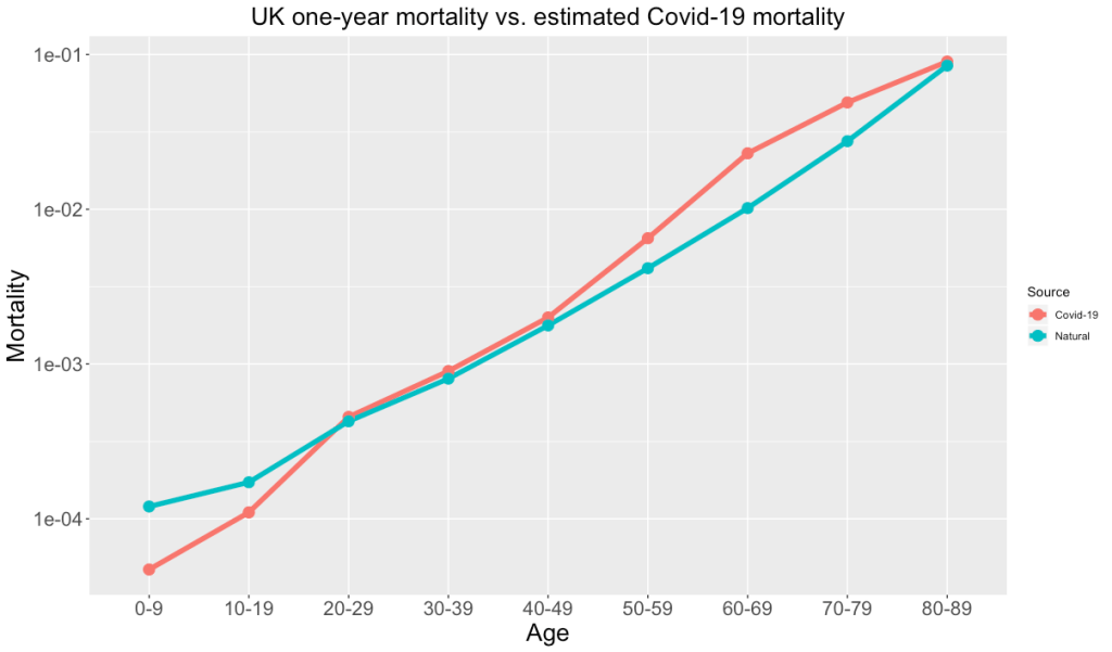
These numbers looked somewhat familiar to me, having just lectured a course on life tables and survival analysis. Recent one-year mortality rates in the UK are in the table below:

0-910-1920-2930-3940-4950-5960-6970-7980-89
.012.17.43.801.84.2102885
One-year mortality probabilities in the UK, in deaths per thousand population. Neonatal mortality has been excluded from the 0-9 class, and the over-80 class has been cut off at 89.

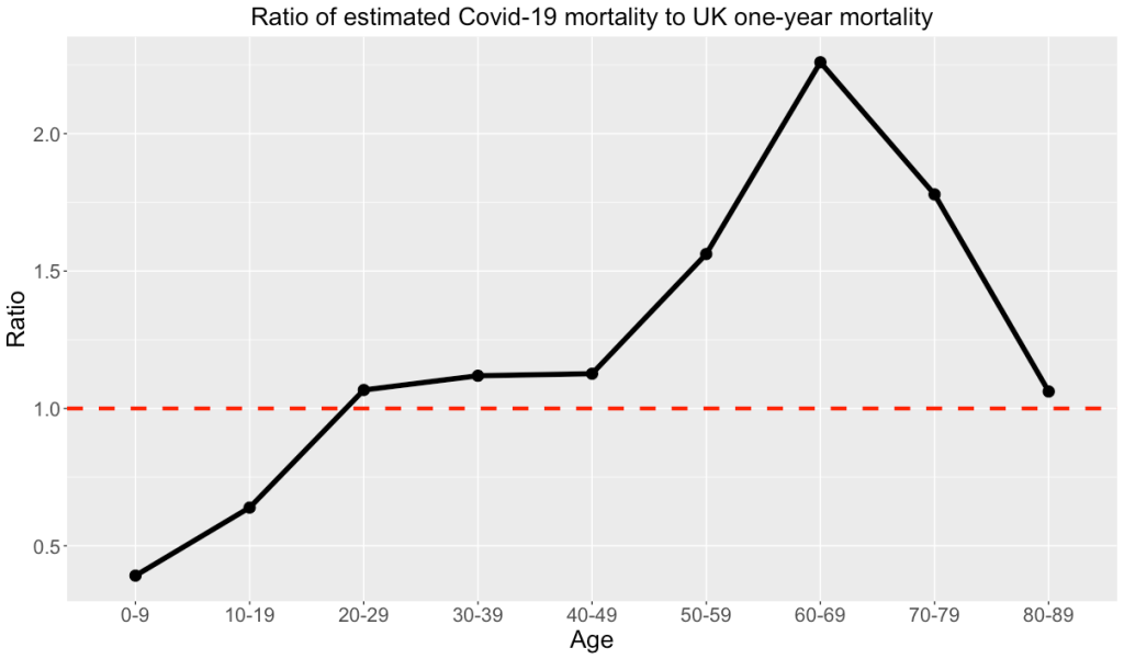
Depending on how you look at it, the Covid-19 mortality is shifted by a decade, or about double the usual one-year mortality probability for an average UK resident (corresponding to the fact that mortality rates double about every 9 years). If you accept the estimates that around half of the population in most of the world will eventually be infected, and if these mortality rates remain unchanged, this means that effectively everyone will get a double dose of mortality risk this year. Somewhat lower (as may be seen in the plots below) for the younger folk, whereas the over-50s get more like a triple dose.

Buddhist causal networks

A little-publicised development in statistics over the past two decades has been the admission of causality into respectable statistical discourse, spearheaded by the computer scientist Judea Pearl. Pearl’s definition (joint with Joseph Harpern) of causation (“X having setting x caused effect E”) has been formulated approximately as follows:

  • X=x and E occurs.
  • But for the fact that X=x, E would not have occurred.

Of course, Pearl is not the first person to think carefully about causality. He would certainly recognise the similarity to Koch’s postulates on demonstrating disease causation by a candidate microbe:

  1. No disease without presence of the organism;
  2. The organism must be isolated from a host containing the disease ;
  3. The disease must arise when the organism is introduced into a healthy animal;
  4. The organism isolated from that animal must be identified as the same original organism.

I was reminded of this recently in reading the Buddhist Assutava Sutta, the discourse on “dependent co-arising”, where this formula (that also appears in very similar wording in a wide range of other Buddhist texts) is stated:

When this is, that is;

This arising, that arises;

When this is not, that is not;

This ceasing, that ceases.

Trump supporters are ignoring the base (rate) — Or, Ich möcht’ so gerne wissen, ob Trumps erpressen

One of the key insights from research on decision-making — from Tversky and Kahneman, Gigerenzer, and others — is the “base rate fallacy”: in judging new evidence people tend to ignore the underlying (prior) likelihood of various outcomes. A famous example, beloved of probability texts and lectures, is the reasonably accurate — 99% chance of a correct result — test for a rare disease (1 in 10,000 in the population). A randomly selected person with a positive test has a 99% chance of not having the disease, since correct positive tests on the 1 in 10,000 infected individuals are far less common than false positive tests on the other 9,999.

This seems to fit into a more general pattern of prioritising new and/or private information over public information that may be more informative, or at least more accessible. Journalists are conspicuously prone to this bias. For instance, as Brexit blogger Richard North has lamented repeatedly, UK journalists would breathlessly hype the latest leaks of government planning documents revealing the extent of adjustments that would be needed for phytosanitary checks at the border, for instance, or aviation, where the same information had been available for a year in official planning documents on the European Commission website. This psychological bias was famously exploited by WWII British intelligence operatives in Operation Mincemeat, where they dropped a corpse stuffed with fake plans for an invasion at Calais into the sea, where they knew it would wind up on the shore in Spain. They knew that the Germans would take the information much more seriously if they thought they had found it covertly. In my own experience of undergraduate admissions at Oxford I have found it striking the extent to which people consider what they have seen in a half-hour interview to be the deep truth about a candidate, outweighing the evidence of examinations and teacher evaluations.

Which brings us to Donald Trump, who has been accused of colluding with foreign governments to defame his political opponents. He has done his collusion both in private and in public. He famously announced in a speech during the 2016 election campaign, “Russia, if you’re listening, I hope you’re able to find the 30,000 emails that are missing. I think you will probably be rewarded mightily by our press.” And just the other day he said “I would think that if [the Ukrainean government] were honest about it, they’d start a major investigation into the Bidens. It’s a very simple answer. They should investigate the Bidens because how does a company that’s newly formed—and all these companies—and by the way, likewise, China should start an investigation into the Bidens because what happened in China is just about as bad as what happened with Ukraine.”

It seems pretty obvious. But no, that’s public information. Trump has dismissed his appeal to Russia as “a joke”, and just yesterday Senator Marco Rubio contended that the fact that the appeal to China was so blatant and public shows that it probably wasn’t “real”, that Trump was “just needling the press knowing that you guys are going to get outraged by it.” The private information is, of course, being kept private, and there seems to be a process by which formerly shocking secrets are moved into the public sphere gradually, so that they slide imperceptibly from being “shocking if true” to “well-known, hence uninteresting”.

I am reminded of the epistemological conundrum posed by the Weimar-era German cabaret song, “Ich möcht’ so gern wissen, ob sich die Fische küssen”:

Ich möcht’ so gerne wissen
Ob sich die Fische küssen –
Unterm Wasser sieht man’s nicht
Na, und überm Wasser tun sie’s nicht!

I would so like to know
if fish sometimes kiss.
Underwater we can’t see it.
And out of the water they never do it.